Create a line graph showing data over time

Let’s say I have an events table with two columns:

event_id (string, some unique id)
time (unix timestamp)

How can I create a query that can be displayed as a line graph of events over time?

I’ve tried the following, which successfully returns data in one hour slices:

select count(id), from_utc_timestamp(from_unixtime(time - (time % 3600), "yyyy-MM-dd HH:mm:ss"), "UTC") AS time
from events
group by time
order by time ASC

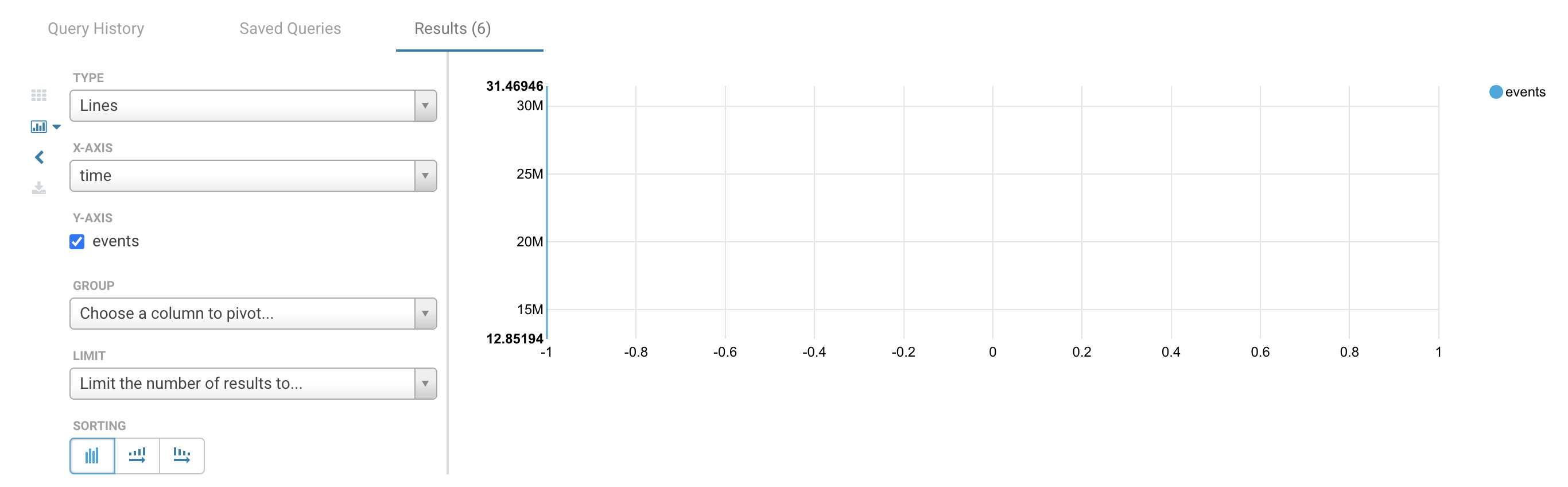
The problem is that the line graph fails to display this properly:

How can I format the time column so that it is both human readable and graphs correctly?

Update:

I figured out that I can use the following for time:

to_utc_timestamp(from_unixtime(time - (time%3600), "yyyy-MM-dd HH:mm:ss"), "UTC") AS time,

This at least displays something when using a time chart, but the X axis labels are in some unexpected time zone, and it still displays nothing when using a line chart. I need the line chart to work because time charts don’t have the pivot capability and I need that to be able to overlay multiple series on the same graph for comparison.

Is there any way to get this to work correctly with either time or line graphs?